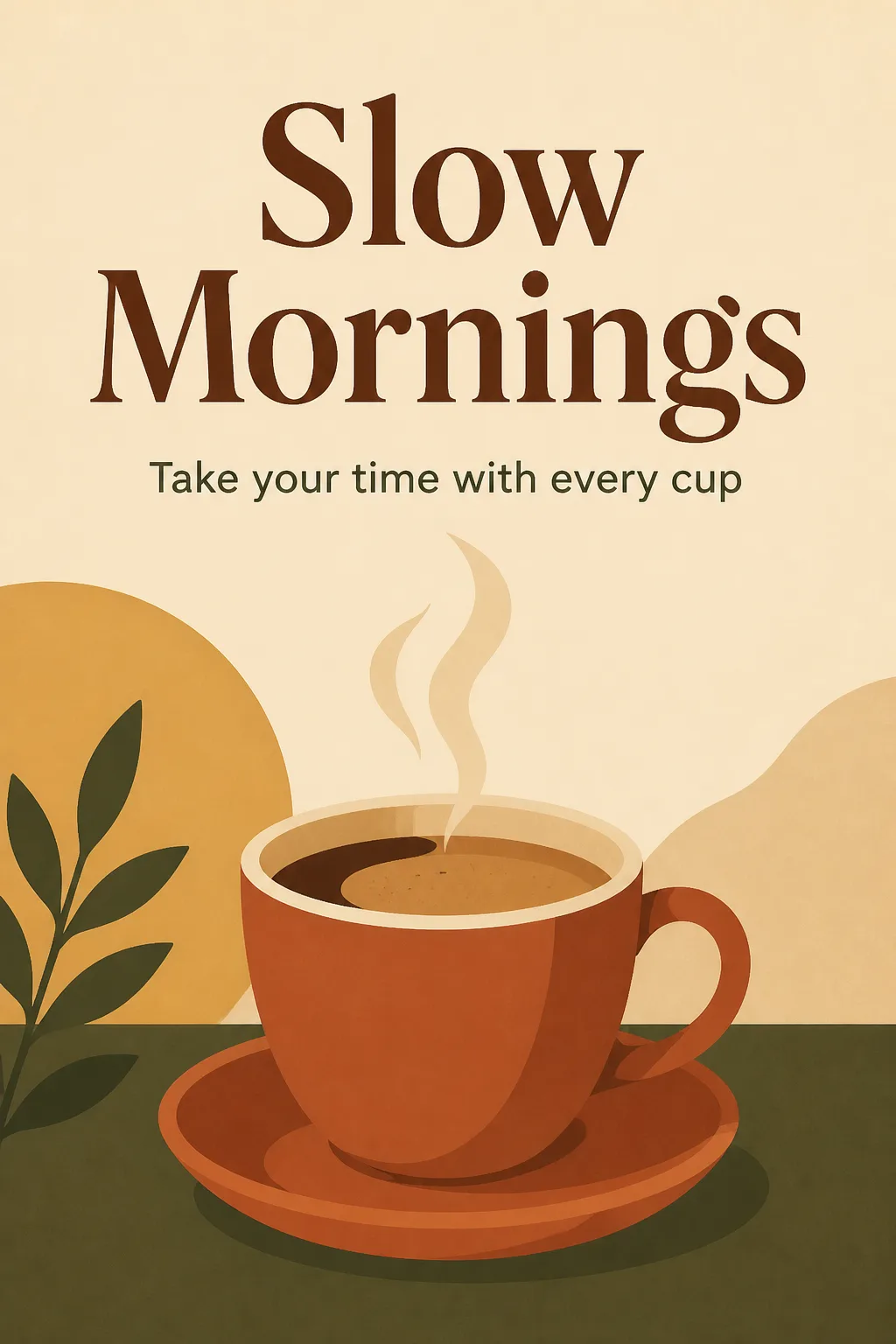
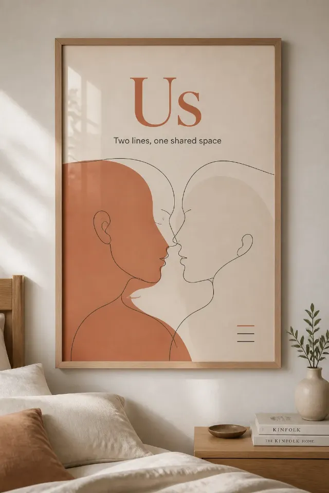
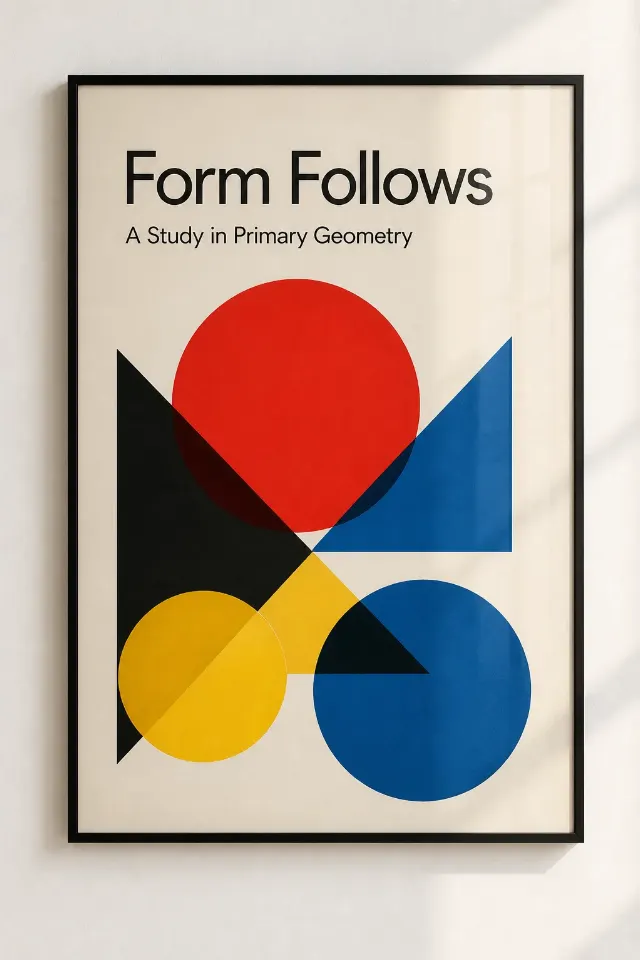
A flat, straight-on coffee shop wall poster in the Format, built around the Main Visual Subject as one bold, simplified illustration. Use the Color Palette in balanced blocks with warm earthy contrast and plenty of cream-colored negative space. Set the Main Title large and deliberate near the upper third, with the Subtitle beneath it in a smaller, clean typeface. Use a clear typographic hierarchy, generous margins and carefully aligned spacing so the poster feels designed for a real print studio rather than a template. Keep the composition calm, welcoming and easy to read from across a room. Render every word exactly as written, with correct spelling and no extra text. Use crisp flat shapes, restrained visual detail and clean edges. Show only the poster, full frame and perfectly front-facing, with no mockup, outer border, watermark, logo or QR code.

Use these details:
Main Title: "Slow Mornings"
Subtitle: "Take your time with every cup"
Main Visual Subject: "A stylized espresso cup with gentle steam"
Color Palette: "Terracotta, coffee brown, muted ochre, cream and deep olive"
Format: "2:3 portrait"
Using your own logo, product or face? Attach it in the chat and say which of the details it replaces.
Your result will come out close to the example rather than identical to it. Change the details to make it yours.