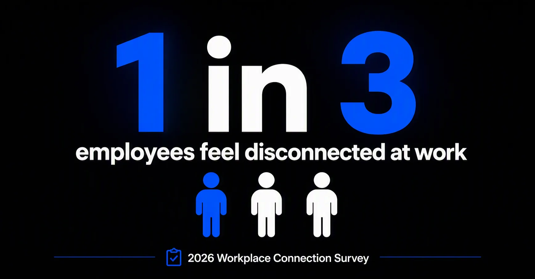
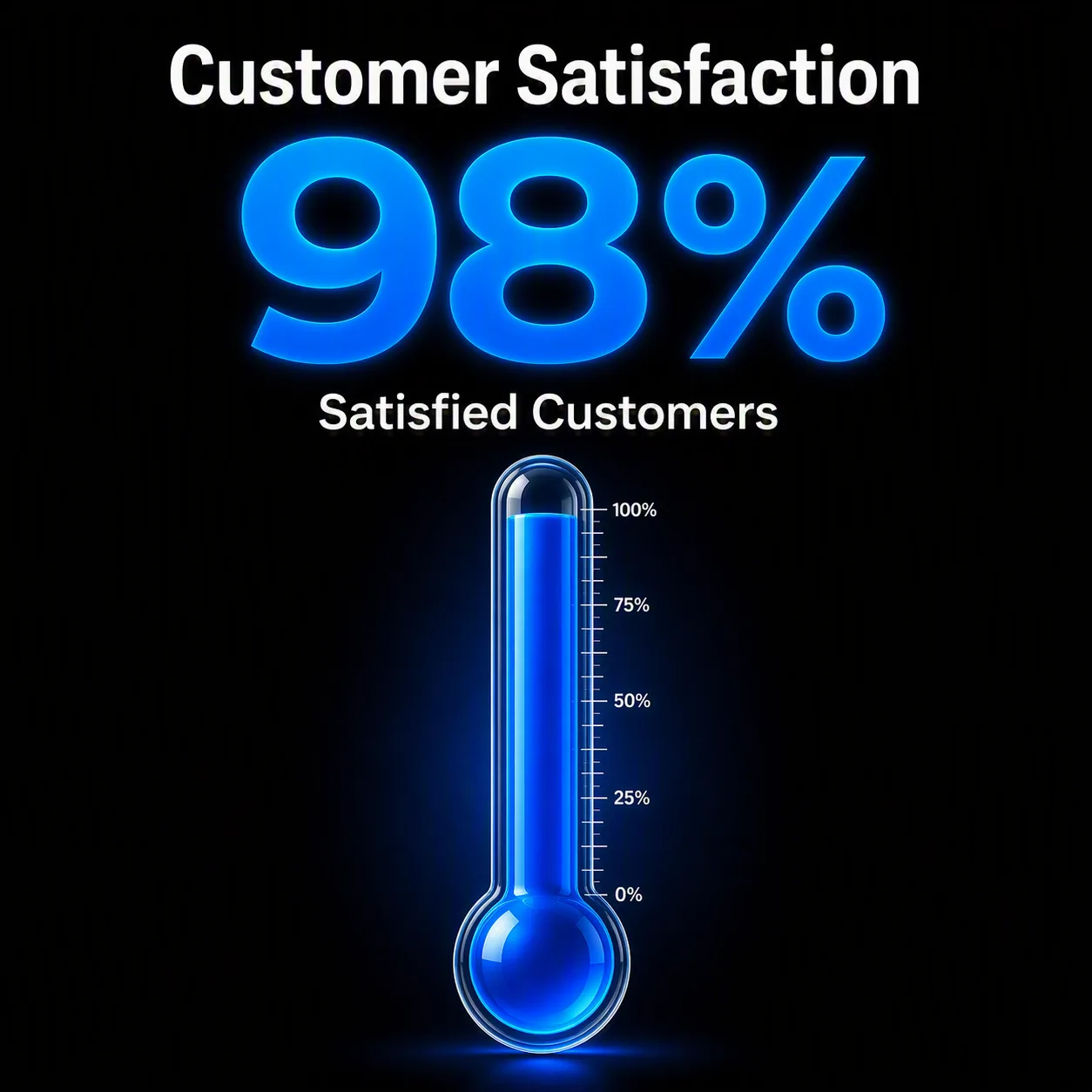
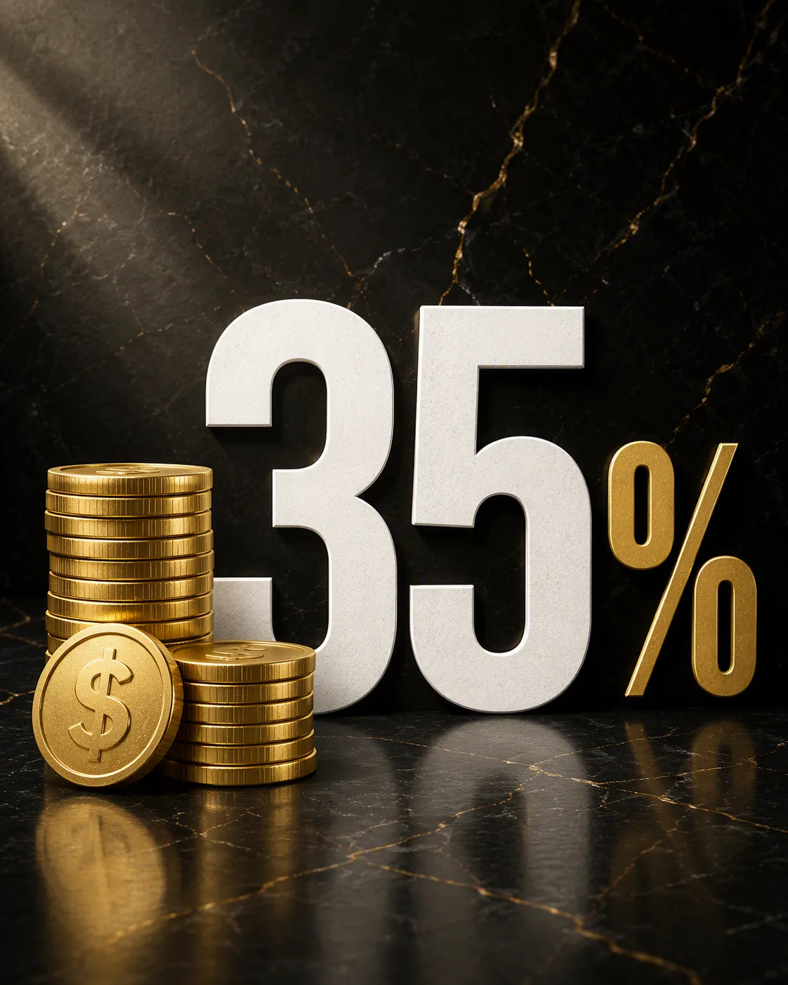
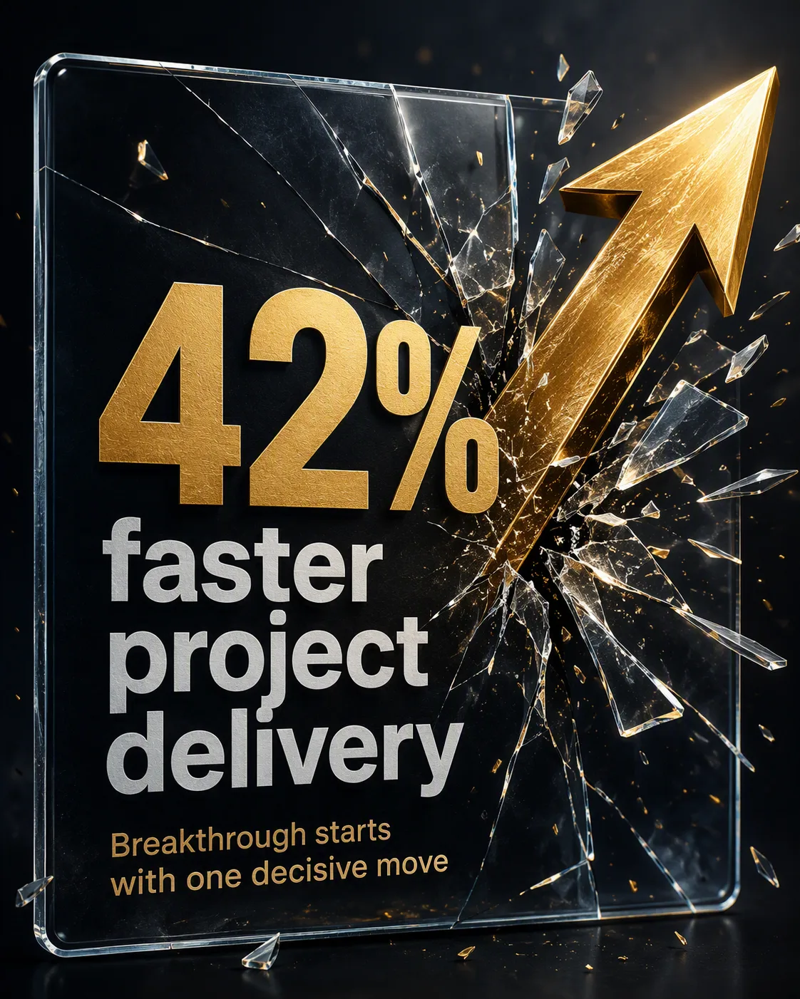
Build a bold LinkedIn statistic graphic around the Statistic Text, with the Supporting Statement directly beneath it and the Survey Label in a small footer line. Show a simple row of human icon silhouettes that visually reinforces the statistic, using one electric-blue silhouette and the others in white. Set the composition against the dark Color Palette with strong contrast, generous negative space and a clear visual hierarchy. Use a modern geometric sans-serif, oversized numerals, precise alignment and restrained infographic styling. Keep every word sharp, correctly spelled and easy to read at mobile size. Center the main statistic while placing the supporting statement below it and the survey label near the bottom edge. Format the finished design as the Format.

Use these details:

Statistic Text: "1 in 3"
Supporting Statement: "employees feel disconnected at work"
Survey Label: "2026 Workplace Connection Survey"
Color Palette: "charcoal black, electric blue and white"
Format: "1200 x 627 pixel LinkedIn post"