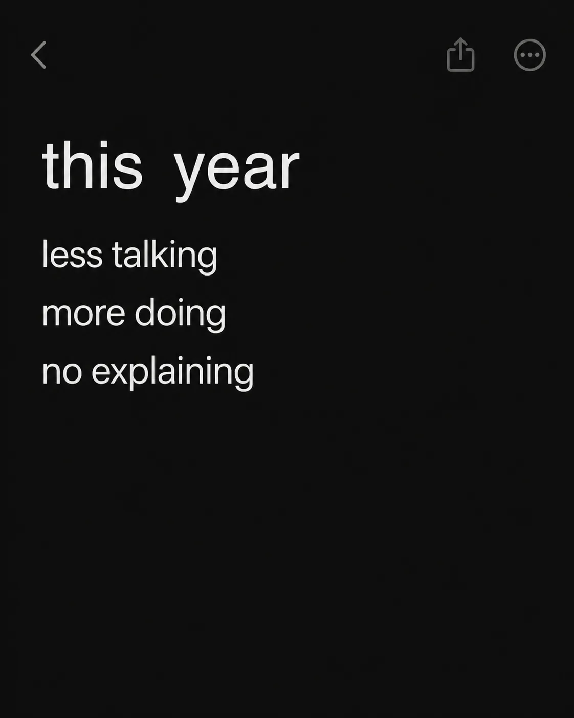
A dark-mode notes app screen arranged as a quiet, minimal social image in the Format. Use the Color Palette for a near-black charcoal interface, soft white text and restrained muted-grey details. Place the Notes Title at the top in a simple clean sans serif, with the Note Lines below it as three separate lines, rendered exactly as written in lowercase. Keep the typography large and comfortably readable at a small phone thumbnail: capital-letter height equivalent of about 4 to 6 percent of the image height, with generous spacing and clear alignment. Use one typeface family throughout, with no decorative effects. Let the screen feel like a real phone notes app through subtle interface spacing and restrained controls, but include no logos, usernames, profile pictures, timestamps, borders or extra captions. Keep the composition spare, with strong negative space and no text inside a separate bar.

Use these details:
Notes Title: "this year"
Note Lines: ["less talking", "more doing", "no explaining"]
Color Palette: "near-black charcoal, soft white and muted grey"
Format: "4:5 portrait social media post"
Using your own logo, product or face? Attach it in the chat and say which of the details it replaces.
Your result will come out close to the example rather than identical to it. Change the details to make it yours.