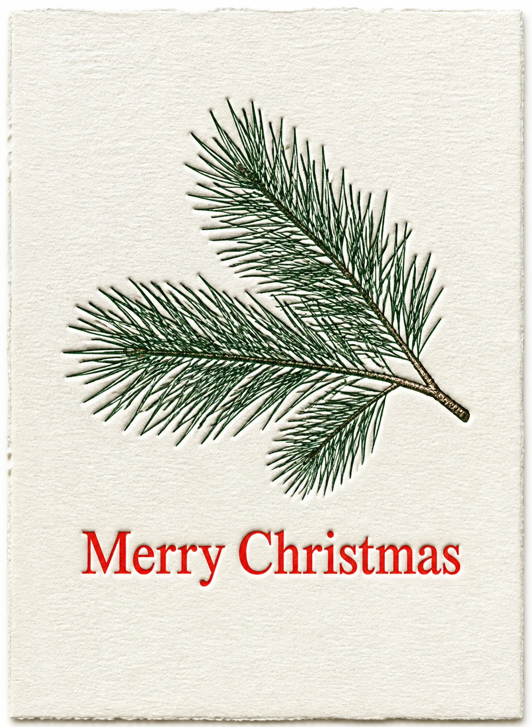
Show the finished front of a Christmas greeting card flat, front-facing and filling the frame in the Format. Make the Main Illustration the visual hero: a single pine branch with carefully rendered needles, created using the Art Style with a convincingly deep-pressed, tactile impression in the Paper Stock. Set the Greeting Text beneath or beside the branch in crisp, classic serif lettering, printed in the strongest accent from the Color Palette. Keep the composition restrained, with generous even margins and a clear hierarchy. Make the cotton fibers, deckled softness and subtle impression shadows visible without making the card look distressed. Use the Color Palette consistently across the paper, branch and lettering. Render the Greeting Text exactly as written, with every word fully legible and correctly spelled. No extra text, border, watermark, signature, random sparkles, glowing effects, plastic 3D or clutter.

Use these details:
Greeting Text: "Merry Christmas"
Art Style: "Traditional letterpress"
Main Illustration: "A single detailed pine branch with layered needles and natural tapering form"
Color Palette: "Deep evergreen, warm white and vermilion red"
Format: "Portrait 5x7 inch card"
Paper Stock: "Thick, softly textured cotton paper"
Using your own logo, product or face? Attach it in the chat and say which of the details it replaces.
Your result will come out close to the example rather than identical to it. Change the details to make it yours.