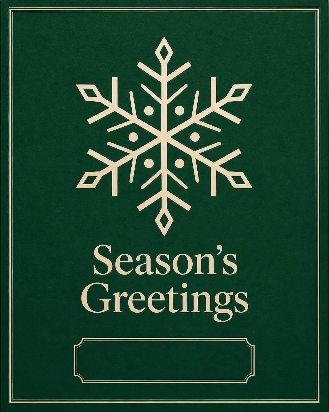
Present the front of a finished corporate Christmas greeting card flat, front-facing and filling the frame in the Format. Use the Main Illustration as the hero, rendered in the Art Style with precise geometry, balanced symmetry and generous negative space. Apply the Color Palette with a deep green card field and a warm white illustration and greeting for clear contrast. Place the Greeting Text in a restrained, highly legible typographic treatment beneath or beside the illustration, keeping the hierarchy simple and the margins generous. Reserve a small, clearly framed empty area near the bottom for a company name, but do not add a company name or placeholder text. Make the card look ready for printing on quality card stock, with subtle paper grain and crisp edges. Keep all visible text in English, spell every word correctly, and use no extra verse. No random sparkles, glowing effects, lens flares, clutter, logos, watermarks or signatures.

Use these details:
Greeting Text: "Season's Greetings"
Art Style: "Minimalist geometric vector illustration with a refined printed card finish"
Main Illustration: "A single clean geometric snowflake"
Color Palette: "Deep green and warm white"
Format: "Portrait 5x7 greeting card, 4:5 ratio"
Using your own logo, product or face? Attach it in the chat and say which of the details it replaces.
Your result will come out close to the example rather than identical to it. Change the details to make it yours.