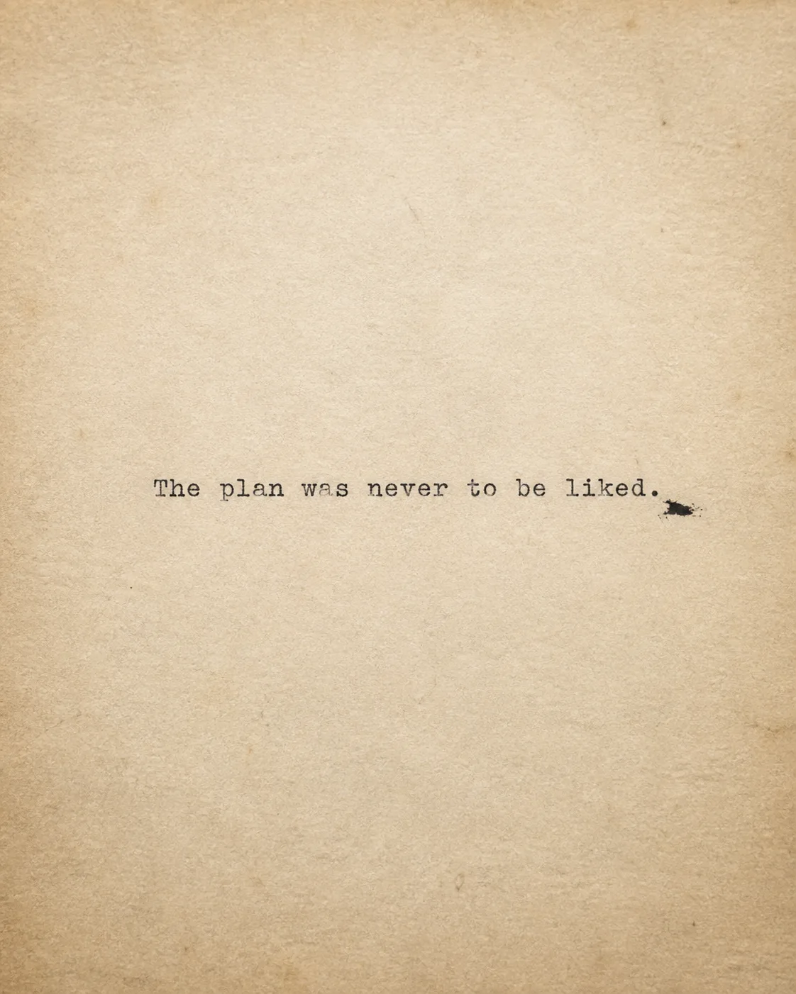
Set the Quote in a single centered line across the Paper Texture, using convincing typewriter lettering with slightly uneven ink coverage and subtle mechanical imperfections. Render the Quote exactly as written, including capitalization and punctuation. Keep the letter height about 4 to 6 percent of the image height, with the line spanning roughly 55 to 75 percent of the frame width so it remains readable as a small phone thumbnail. Place the Ink Smudge near the final word without touching or obscuring the text. Use the Color Palette across the paper and ink, with soft natural shadows, restrained contrast and no decorative elements. Photograph the sheet from directly above with a quiet analog still-life feel, visible fibers, gentle edge falloff and fine film grain. Keep generous negative space around the line and compose the result in the Format. Include no logos, borders, watermarks or extra captions.

Use these details:
Quote: "The plan was never to be liked."
Paper Texture: "warm, fibrous paper with softened edges and faint age marks"
Ink Smudge: "a small uneven black ink smudge beside the final word"
Color Palette: "muted cream, charcoal black and faded sepia"
Format: "4:5 Instagram post"
Using your own logo, product or face? Attach it in the chat and say which of the details it replaces.
Your result will come out close to the example rather than identical to it. Change the details to make it yours.