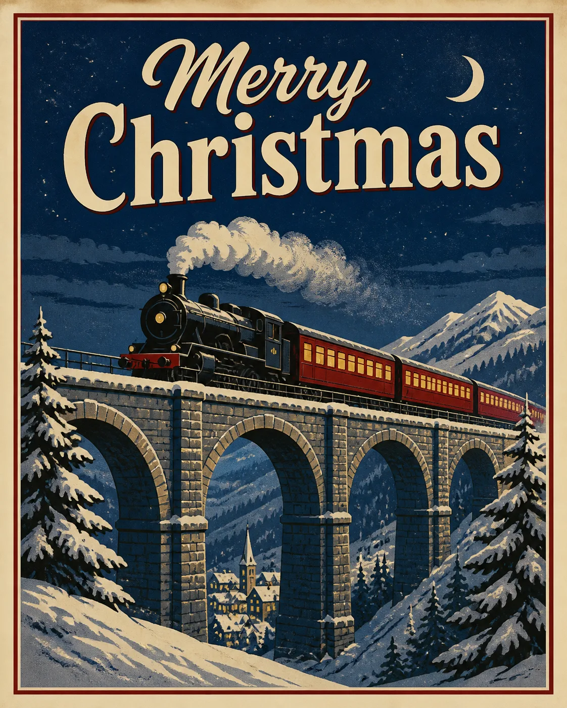
Design the front of a finished Christmas greeting card, shown flat and front-facing, filling the frame in the Format. Build the composition around the Main Illustration, with the train and snowy viaduct clearly readable as the hero scene beneath a deep winter sky. Render it in the Art Style with the visual language of a classic printed travel poster: bold simplified shapes, confident outlines, restrained perspective, subtle aged paper grain and slightly imperfect ink texture. Use the Color Palette with strong contrast between the night sky, snow, train and warmly lit windows. Place the Greeting Text prominently but keep it secondary to the illustration, using clean vintage display lettering that is fully legible and correctly spelled. Keep generous margins, a balanced poster-like hierarchy and no extra wording. Make it look ready to print on quality card stock, with no logos, signatures, watermarks, random sparkles, glowing orbs or lens flares.

Use these details:
Greeting Text: "Merry Christmas"
Art Style: "Vintage winter travel poster illustration"
Main Illustration: "A classic passenger train crossing a snow-covered stone viaduct at night"
Color Palette: "Midnight blue, snowy white, muted cranberry red and warm golden yellow"
Format: "Portrait 5x7 greeting card front, 4:5 ratio"
Using your own logo, product or face? Attach it in the chat and say which of the details it replaces.
Your result will come out close to the example rather than identical to it. Change the details to make it yours.