Show the finished card front flat, front-facing and filling the frame in the Format. Make the Main Illustration the hero, arranged with clear hierarchy, generous cream margins and no elements touching the edges. Render the Art Style convincingly on textured, quality card stock, with an aged printed finish and subtle tactile paper grain. Place the Greeting Text prominently on the typewriter paper in crisp, fully legible English lettering, preserving its exact spelling and wording. Use the Color Palette consistently across the illustration, paper and typography. Keep the composition nostalgic, restrained and uncluttered, with carefully balanced negative space. The result should look like a print-ready vintage Christmas greeting card, with no extra text, random sparkles, glowing effects, logos, signatures or watermarks.

Use these details:
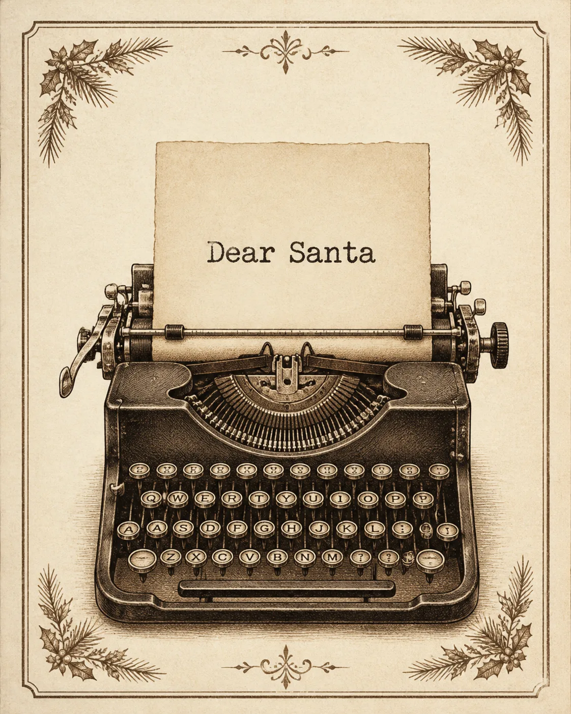
Greeting Text: "Dear Santa"
Art Style: "Vintage sepia illustration with letterpress texture"
Main Illustration: "A classic mechanical typewriter with a sheet of paper emerging from it"
Color Palette: "Warm cream, sepia brown, muted parchment and soft charcoal"
Format: "Portrait 5x7 greeting card front, 4:5 ratio"
Using your own logo, product or face? Attach it in the chat and say which of the details it replaces.
Your result will come out close to the example rather than identical to it. Change the details to make it yours.