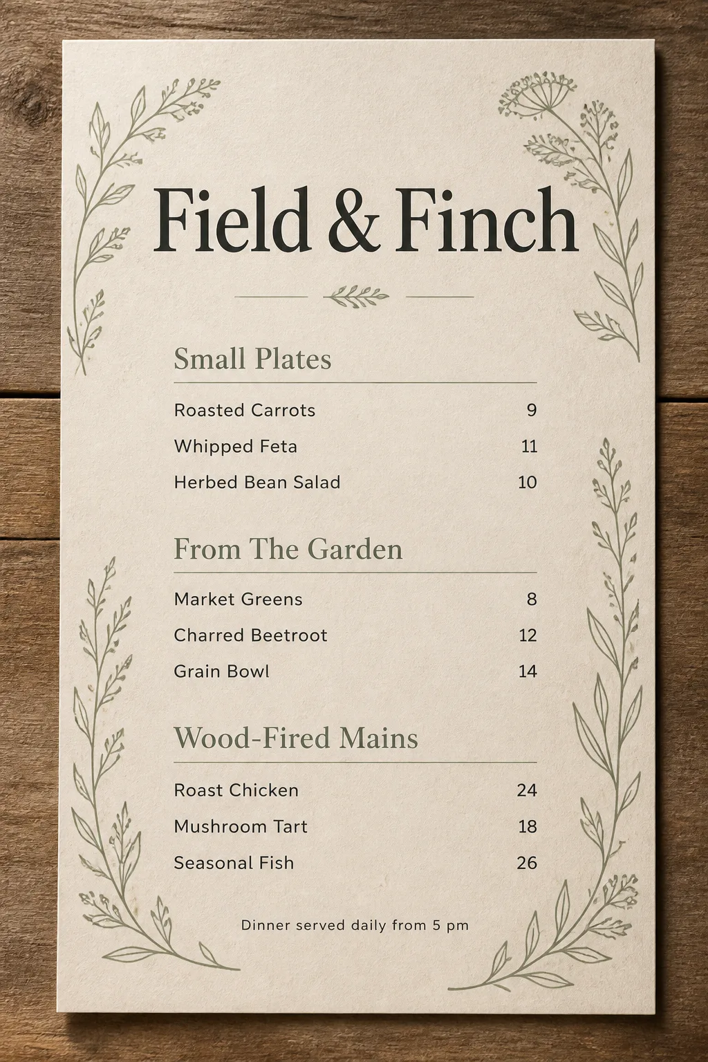
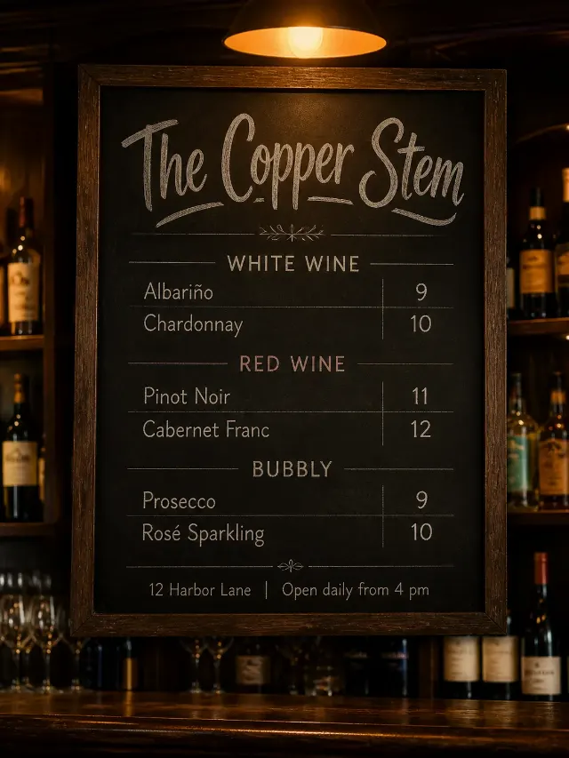
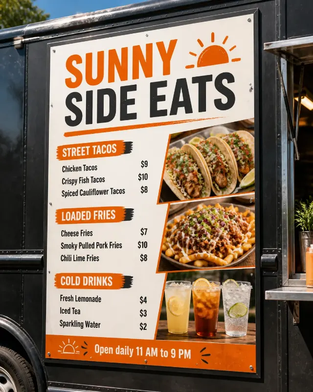
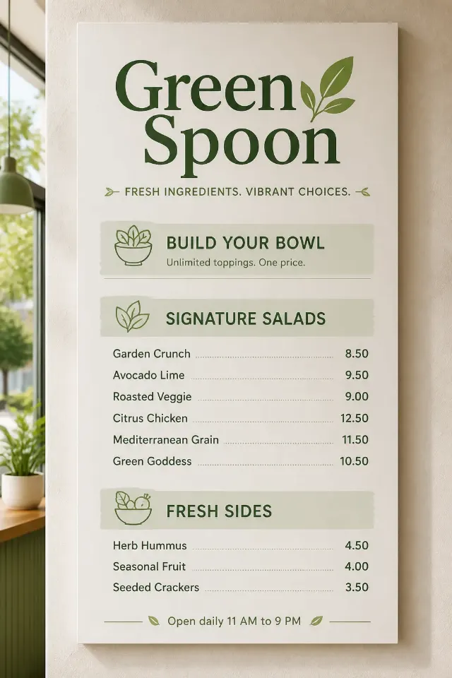
Lay out a farm-to-table restaurant menu for Venue Name as a top-down printed design, placed flat on a rustic wooden board. Use the Color Palette and the Paper Texture throughout, with delicate botanical line art framing the content without crowding it. Set Venue Name as the largest text element, then organize the Menu Items beneath the corresponding Section Headings, using the Prices in a clean, consistent grid with prices aligned to the right. Use no more than two typefaces: an organic serif for the venue and headings, paired with a highly legible sans serif for the items and prices. Include Footer Line in small type at the bottom. Keep the design airy, restrained and easy to read, with accurate spelling, even spacing and no overlapping text. Photograph the finished menu from directly above with soft natural window light, believable paper shadows and subtle wood grain. Show one clear menu sheet, with no extra props, borders, logos, watermarks or QR codes.

Use these details:
Venue Name: "Field & Finch"
Section Headings: ["Small Plates", "From The Garden", "Wood-Fired Mains"]
Item Names: ["Roasted Carrots", "Whipped Feta", "Herbed Bean Salad", "Market Greens", "Charred Beetroot", "Grain Bowl", "Roast Chicken", "Mushroom Tart", "Seasonal Fish"]
Prices: ["9", "11", "10", "8", "12", "14", "24", "18", "26"]
Footer Line: "Dinner served daily from 5 pm"
Color Palette: "warm kraft, sage green, charcoal and cream"
Paper Texture: "lightly fibrous recycled paper with subtle flecks"
Using your own logo, product or face? Attach it in the chat and say which of the details it replaces.
Your result will come out close to the example rather than identical to it. Change the details to make it yours.