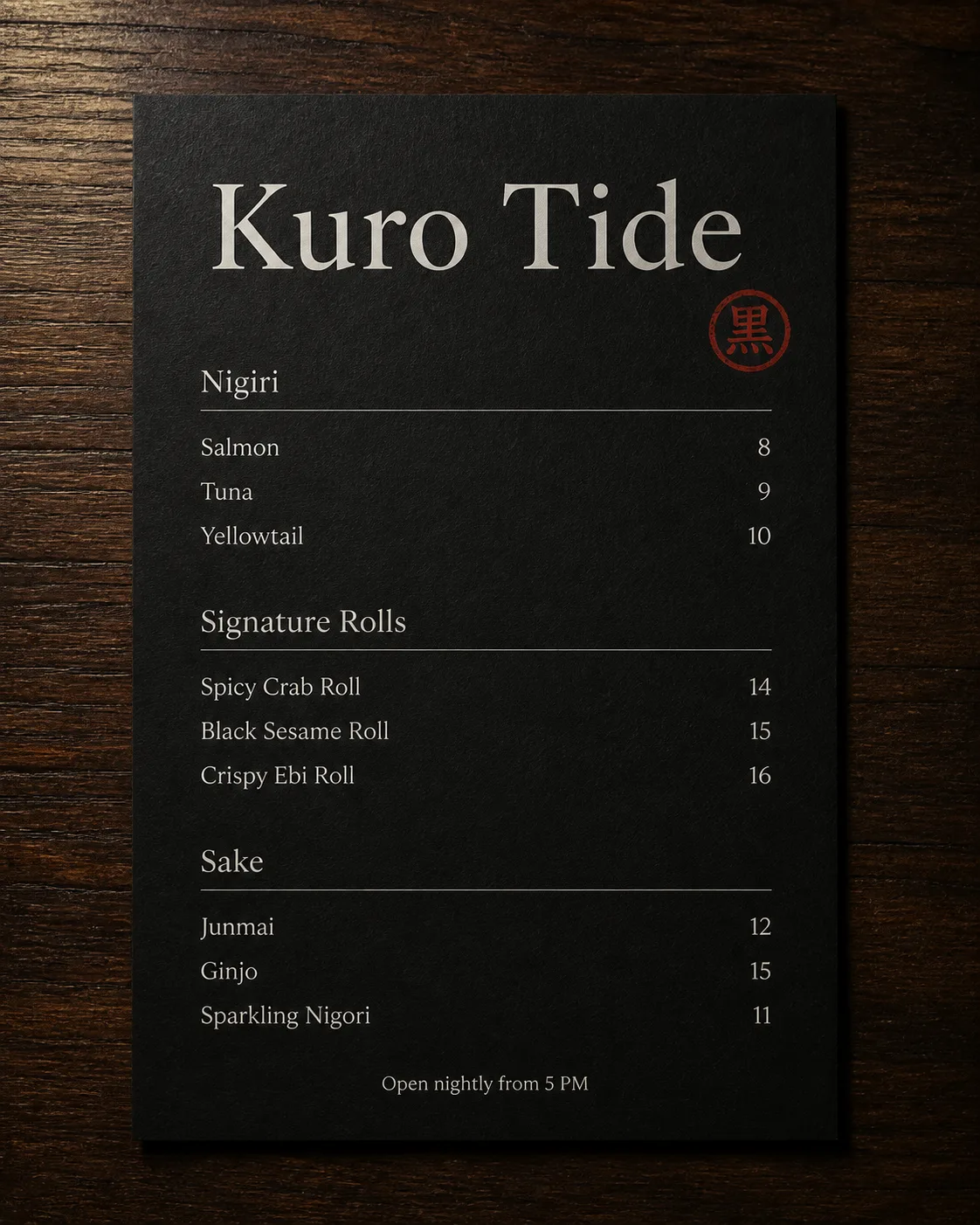
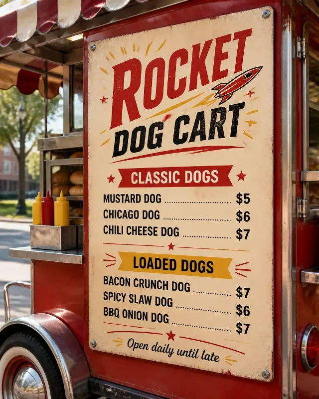
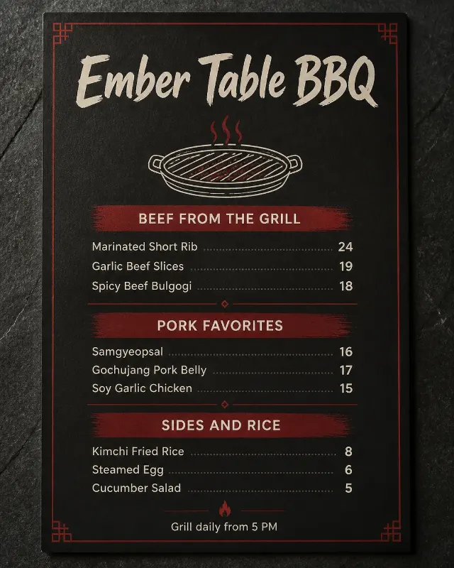
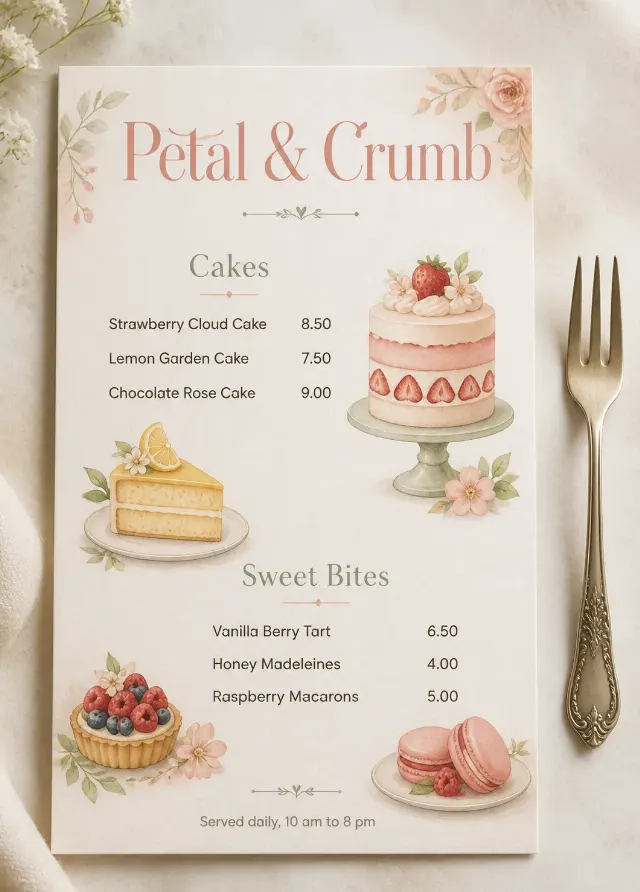
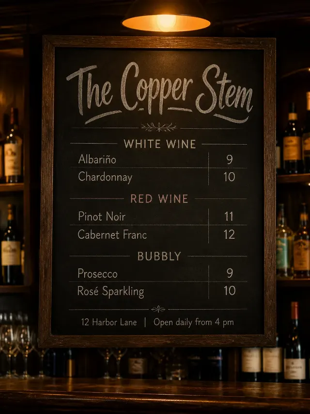
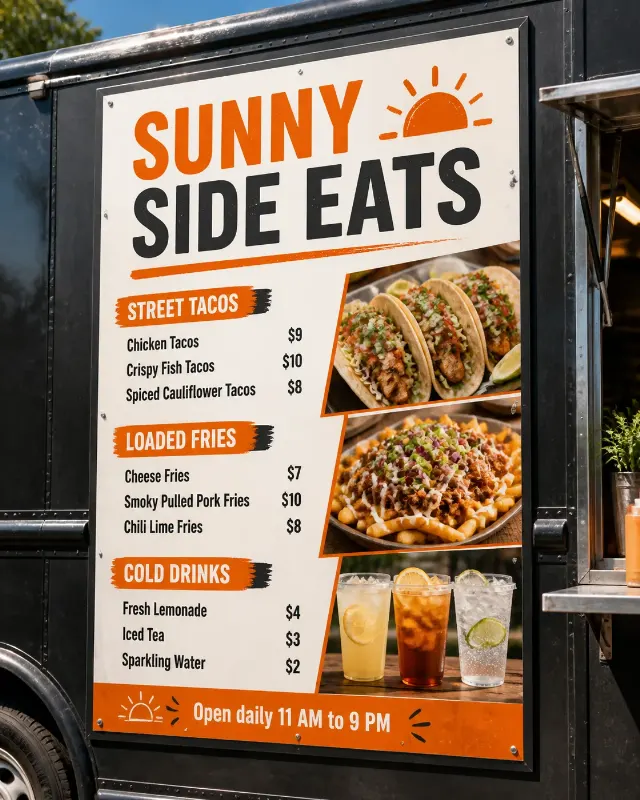
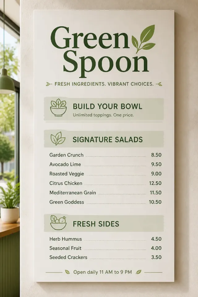
Lay out a refined sushi bar menu for the Venue Name, photographed flat from directly overhead on the Menu Surface. Use the Color Palette with a matte black menu card, minimal soft-white typography and one small vermilion red accent stamp or seal. Make the venue name the largest text element, with a restrained Japanese-inspired editorial feel and generous negative space. Organize the content into three clean sections: Section Heading One with Section One Items and matching Section One Prices, Section Heading Two with Section Two Items and matching Section Two Prices, and Section Heading Three with Section Three Items and matching Section Three Prices. Align item names and prices on a precise grid, keeping prices right-aligned. Add the Optional Footer Line discreetly at the bottom. Use no more than two typefaces, ensure every word is spelled correctly and legible, and keep all text away from the accent mark. Show believable paper texture, soft directional light and natural shadows on the table, with no extra props, logos, QR codes or image border.

Use these details:
Venue Name: "Kuro Tide"
Section Heading One: "Nigiri"
Section One Items: ["Salmon", "Tuna", "Yellowtail"]
Section One Prices: ["8", "9", "10"]
Section Heading Two: "Signature Rolls"
Section Two Items: ["Spicy Crab Roll", "Black Sesame Roll", "Crispy Ebi Roll"]
Section Two Prices: ["14", "15", "16"]
Section Heading Three: "Sake"
Section Three Items: ["Junmai", "Ginjo", "Sparkling Nigori"]
Section Three Prices: ["12", "15", "11"]
Optional Footer Line: "Open nightly from 5 PM"
Color Palette: "matte black, soft white and deep vermilion red"
Menu Surface: "dark walnut table"
Using your own logo, product or face? Attach it in the chat and say which of the details it replaces.
Your result will come out close to the example rather than identical to it. Change the details to make it yours.