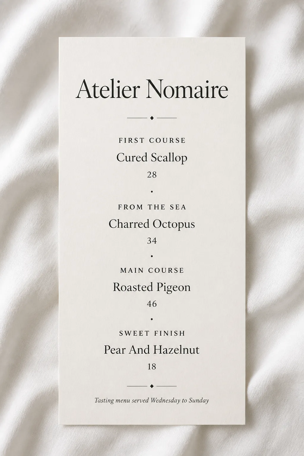
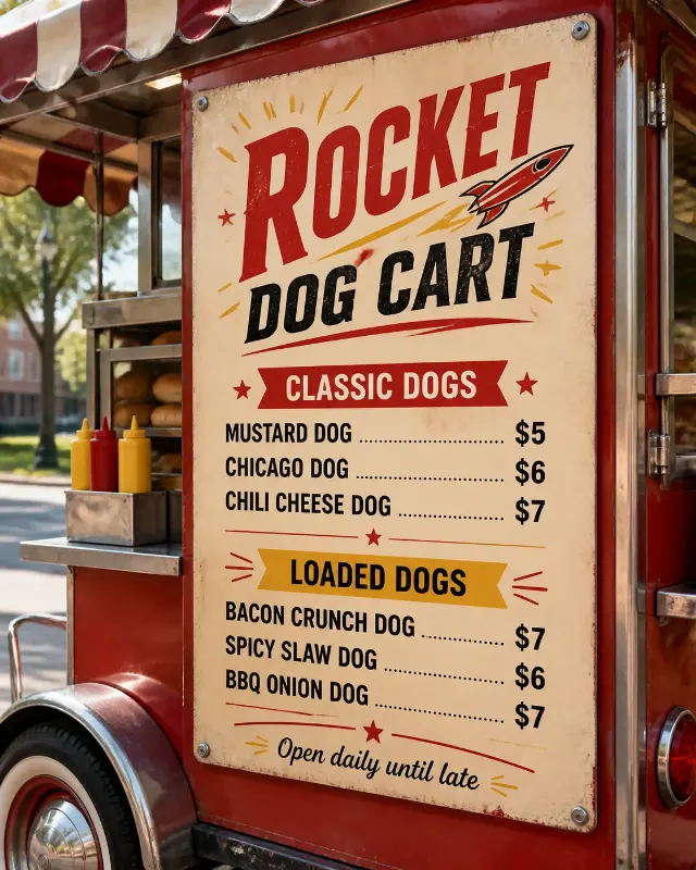
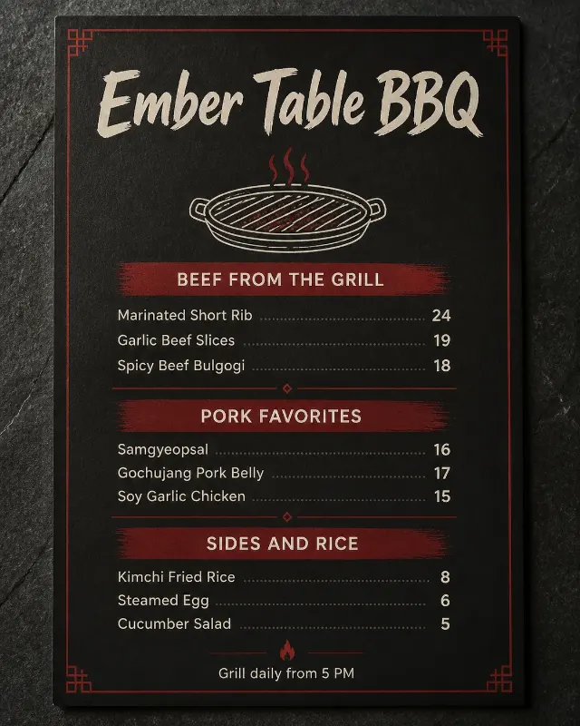
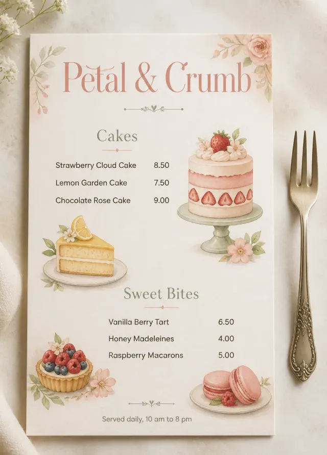
A single tall fine dining tasting menu card lies flat on softly rumpled white linen, viewed from directly overhead in the Format. Set the Venue Name as the largest element, centered near the top in an elegant serif typeface. Arrange the Section Headings, Item Names and Prices in a restrained vertical hierarchy with generous white space, consistent centered alignment and precise spacing. Use the Color Palette throughout, with minimal soft charcoal rules or tiny typographic accents only where they improve structure. Place the Footer Line discreetly at the bottom. Use no more than two typefaces, with refined serif lettering as the visual focus. Render every text element exactly as provided, correctly spelled, crisp and fully legible. Use soft natural window light, subtle linen texture and believable contact shadows. Keep the composition quiet and luxurious, with no additional props, illustrations, logos, QR codes or border around the image.

Use these details:
Venue Name: "Atelier Nomaire"
Section Headings: ["First Course", "From The Sea", "Main Course", "Sweet Finish"]
Item Names: ["Cured Scallop", "Charred Octopus", "Roasted Pigeon", "Pear And Hazelnut"]
Prices: ["28", "34", "46", "18"]
Footer Line: "Tasting menu served Wednesday to Sunday"
Color Palette: "warm white, ivory and soft charcoal"
Format: "2:3 vertical"
Using your own logo, product or face? Attach it in the chat and say which of the details it replaces.
Your result will come out close to the example rather than identical to it. Change the details to make it yours.