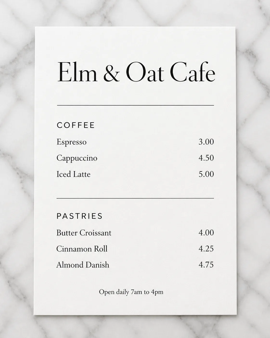
Lay out a minimalist cafe menu on a white card, photographed flat from directly overhead on the Surface. Place the Venue Name prominently at the top in an elegant black serif typeface, with generous white space and a calm editorial rhythm. Organize the menu into the Section Headings, using two clearly separated sections with thin black rules. Set the Item Names in a clean, consistent grid and pair each item with its matching Price, aligned neatly on the right. Add the Footer Line in small type at the bottom. Use the Color Palette, no more than two typefaces, precise spacing, crisp legible text, and realistic card texture. Keep the composition sparse and refined, with no props, logos, borders around the image, watermarks, or overlapping text.

Use these details:
Venue Name: "Elm & Oat Cafe"
Section Headings: ["Coffee", "Pastries"]
Item Names: ["Espresso", "Cappuccino", "Iced Latte", "Butter Croissant", "Cinnamon Roll", "Almond Danish"]
Prices: ["3.00", "4.50", "5.00", "4.00", "4.25", "4.75"]
Color Palette: "white card, black type, soft gray marble"
Surface: "white marble table with subtle gray veining"
Footer Line: "Open daily 7am to 4pm"
Using your own logo, product or face? Attach it in the chat and say which of the details it replaces.
Your result will come out close to the example rather than identical to it. Change the details to make it yours.