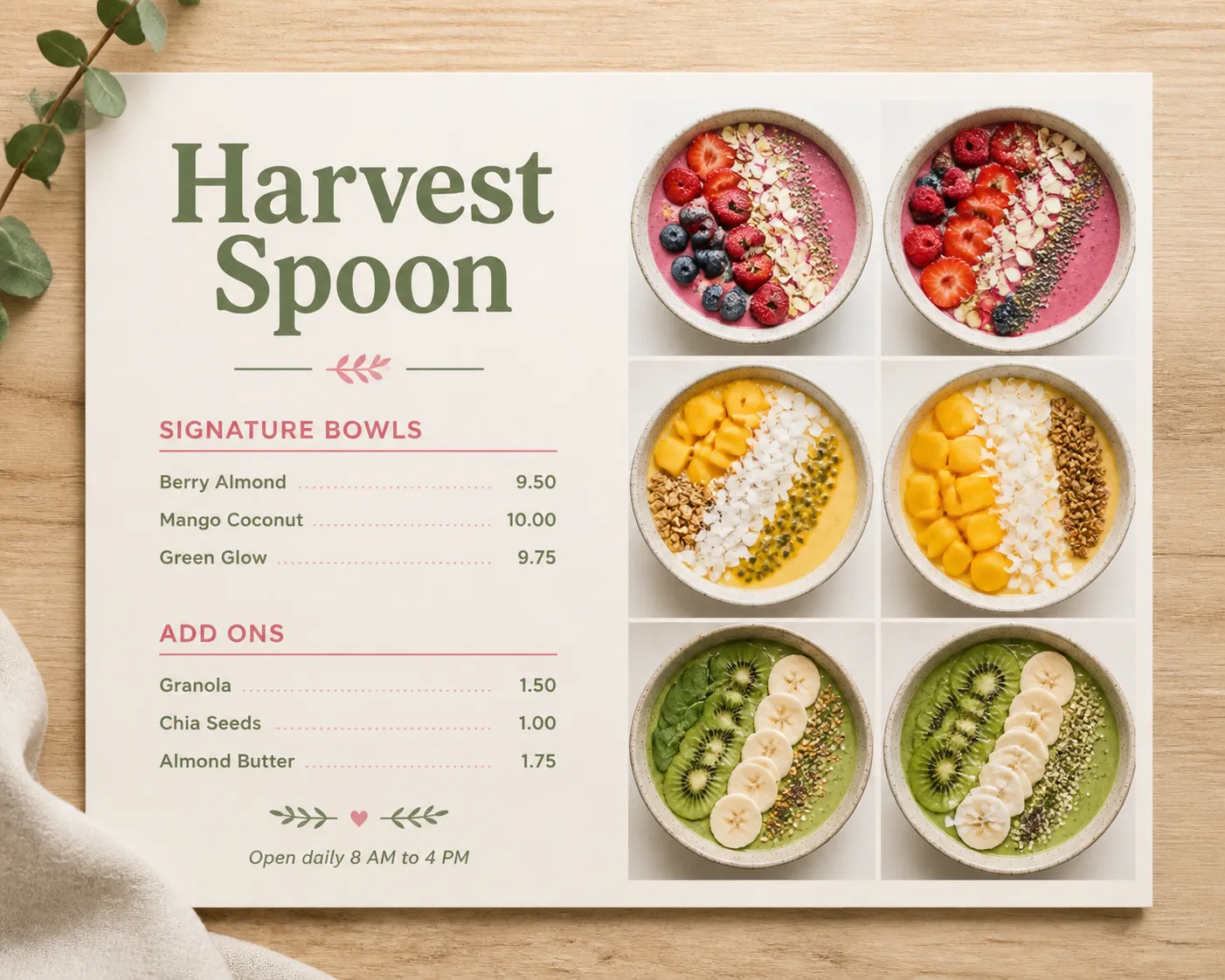
Lay out a cafe menu for the Venue Name as a clean, professionally designed flat lay on a light wood surface. Use the Color Palette across the menu, with a spacious white base and subtle visual contrast. Arrange a neat grid of overhead smoothie bowl photographs beside or around the menu content, showing colorful toppings, creamy textures and carefully styled ingredients. Make the Venue Name the largest text element. Set Section 1 Heading and Section 2 Heading as distinct sections, with Section 1 Item Names and Section 2 Item Names aligned to their matching Section 1 Prices and Section 2 Prices on a consistent grid. Keep the text volume low, use no more than two typefaces, and make every word and price legible. Add the Footer Line as a small final line. Use soft natural light, realistic paper texture, restrained shadows and balanced spacing. No descriptions, logos, QR codes, watermarks or border around the image.

Use these details:
Venue Name: "Harvest Spoon"
Section 1 Heading: "Signature Bowls"
Section 1 Item Names: ["Berry Almond", "Mango Coconut", "Green Glow"]
Section 1 Prices: ["9.50", "10.00", "9.75"]
Section 2 Heading: "Add Ons"
Section 2 Item Names: ["Granola", "Chia Seeds", "Almond Butter"]
Section 2 Prices: ["1.50", "1.00", "1.75"]
Footer Line: "Open daily 8 AM to 4 PM"
Color Palette: "white, oat beige, soft berry pink and muted green"
Using your own logo, product or face? Attach it in the chat and say which of the details it replaces.
Your result will come out close to the example rather than identical to it. Change the details to make it yours.