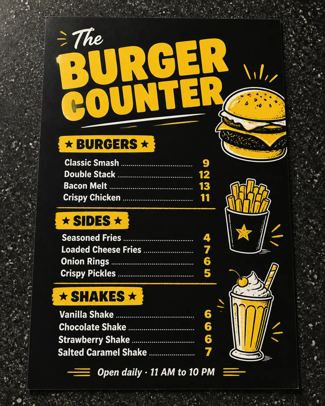
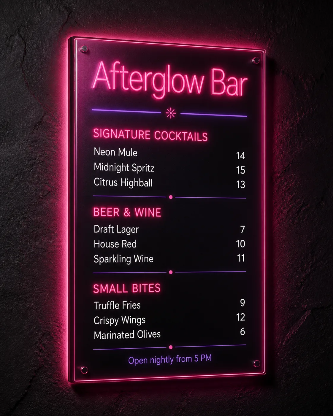
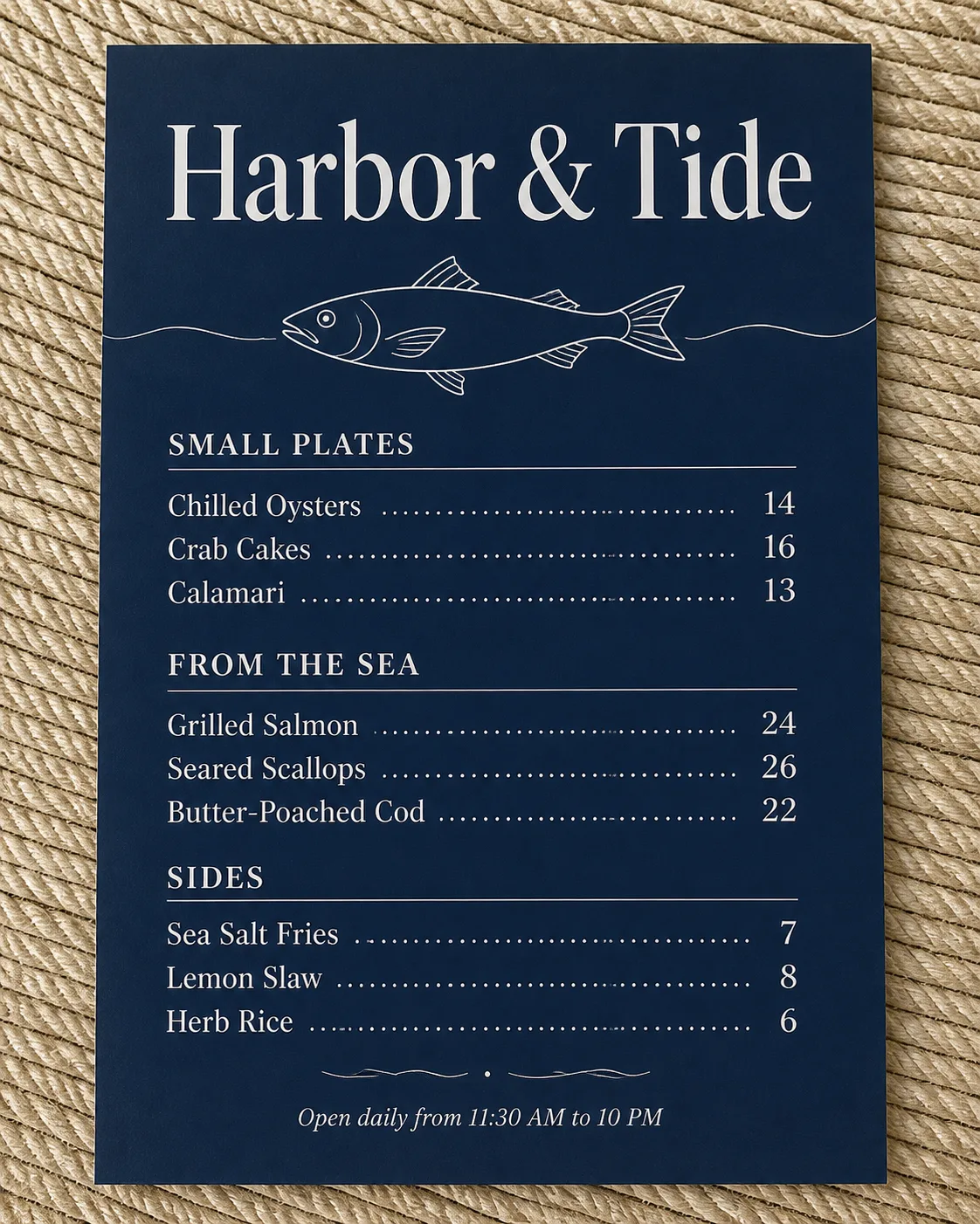
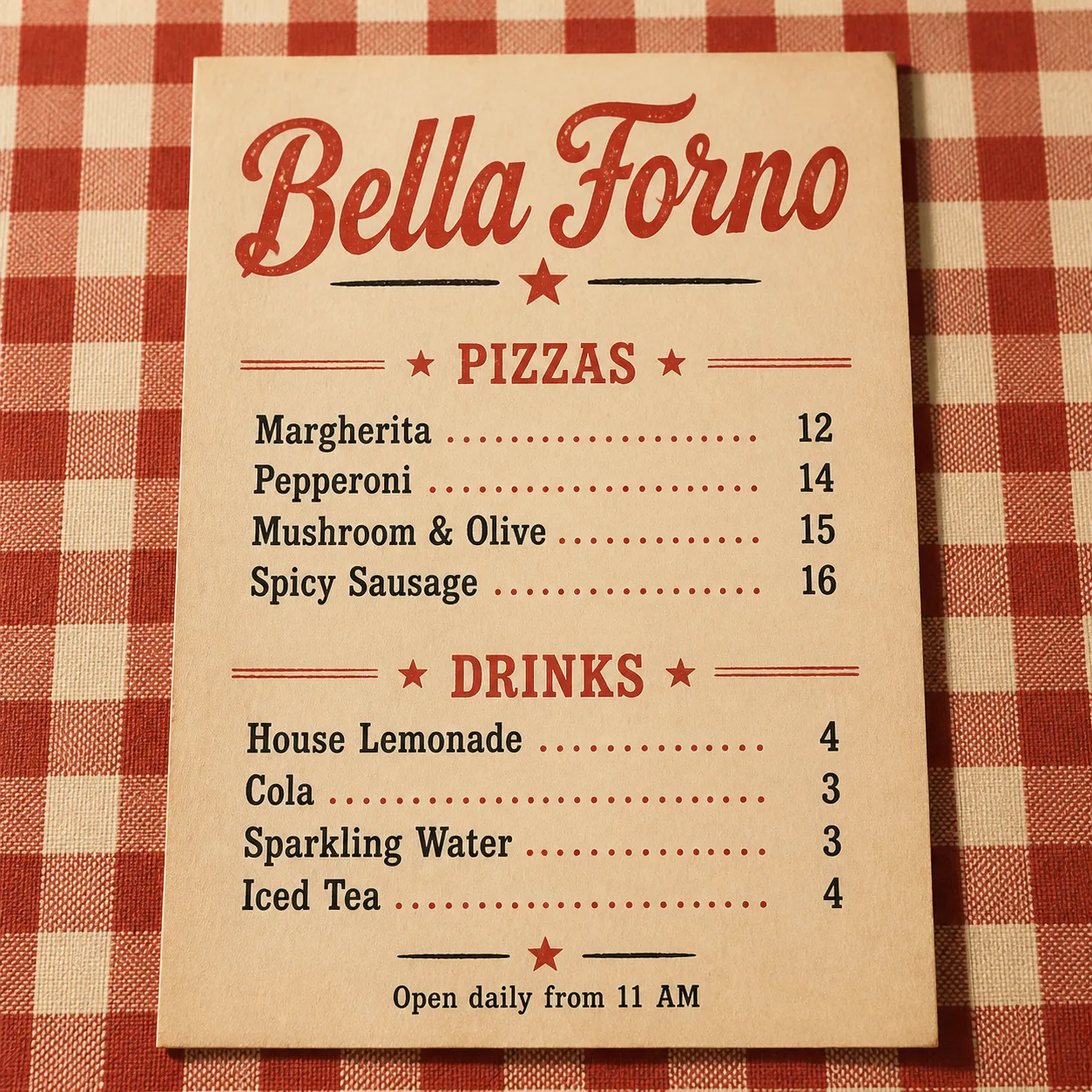
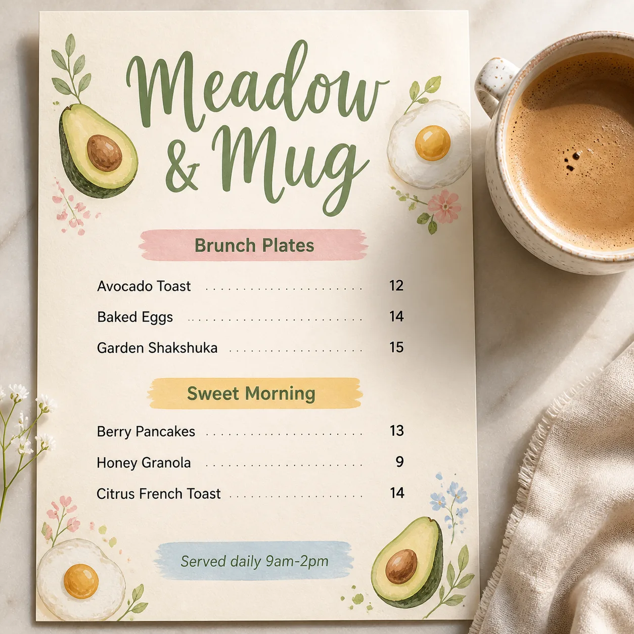
A flat, top-down menu design for the Venue Name, photographed on the Counter Surface with believable diner lighting, soft contact shadows and subtle paper texture. Use the Color Palette across the menu, with bold black ground areas and yellow graphic accents. Set the Venue Name as the largest element in chunky display type, then organize the Section Headings into three clear sections. Place the Item Names and matching Prices on a consistent grid, with prices right-aligned and easy to scan. Use no more than two typefaces, combining heavy rounded display lettering with a simple, highly legible supporting face. Add the Footer Line as a small final detail. Keep the layout energetic but uncluttered, with simple burger, fries and shake illustrations used sparingly as supporting decoration. Render every word correctly, with no overlaps, clipped text, watermarks, logos, QR codes or border around the image.

Use these details:
Venue Name: "The Burger Counter"
Section Headings: ["Burgers", "Sides", "Shakes"]
Item Names: ["Classic Smash", "Double Stack", "Bacon Melt", "Crispy Chicken", "Seasoned Fries", "Loaded Cheese Fries", "Onion Rings", "Crispy Pickles", "Vanilla Shake", "Chocolate Shake", "Strawberry Shake", "Salted Caramel Shake"]
Prices: ["9", "12", "13", "11", "4", "7", "6", "5", "6", "6", "6", "7"]
Color Palette: "bold black and warm diner yellow with small white accents"
Counter Surface: "dark speckled laminate diner counter"
Footer Line: "Open daily · 11 AM to 10 PM"
Using your own logo, product or face? Attach it in the chat and say which of the details it replaces.
Your result will come out close to the example rather than identical to it. Change the details to make it yours.