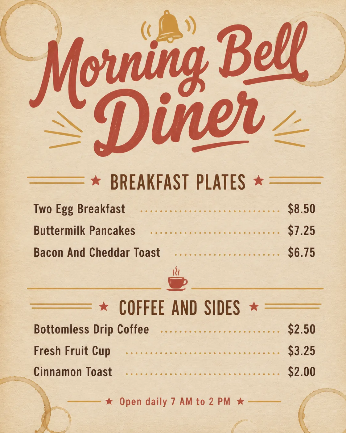
Lay out a casual breakfast diner menu on the Placemat Material, viewed completely flat from directly overhead in the Format. Make the Venue Name the largest element at the top, with a friendly hand-lettered display style. Organize the Section Headings into two clearly separated sections, using no more than two typefaces. Place the Item Names in a clean, consistent grid with the matching Prices right-aligned on the same lines. Keep the menu text sparse and highly legible, with generous spacing and no descriptions. Add the Optional Footer Line in small type at the bottom. Use the Color Palette throughout the typography and simple decorative accents, such as modest divider lines or tiny breakfast-themed marks. Include the Coffee Ring Stains as natural, uneven marks on the paper without obscuring any text. Show believable paper texture and soft, diffuse overhead lighting with subtle shadows. Make it look like a professionally printed placemat menu, not a clip-art template. Ensure every word is spelled correctly, with no overlapping text, watermarks, logos, QR codes or outer image border.

Use these details:
Venue Name: "Morning Bell Diner"
Section Headings: ["Breakfast Plates", "Coffee And Sides"]
Item Names: ["Two Egg Breakfast", "Buttermilk Pancakes", "Bacon And Cheddar Toast", "Bottomless Drip Coffee", "Fresh Fruit Cup", "Cinnamon Toast"]
Prices: ["$8.50", "$7.25", "$6.75", "$2.50", "$3.25", "$2.00"]
Optional Footer Line: "Open daily 7 AM to 2 PM"
Placemat Material: "warm off-white recycled paper"
Coffee Ring Stains: "a few faint brown coffee rings near the corners and lower edge"
Color Palette: "cream, faded mustard, warm brown and muted red"
Format: "4:5 portrait"
Using your own logo, product or face? Attach it in the chat and say which of the details it replaces.
Your result will come out close to the example rather than identical to it. Change the details to make it yours.