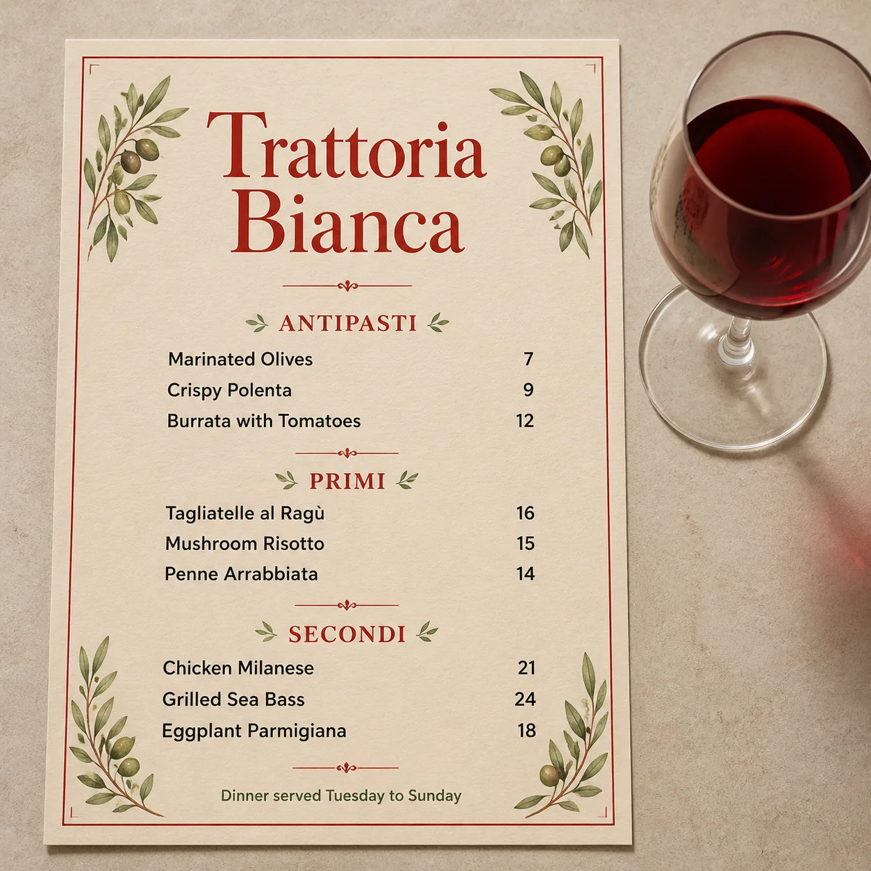
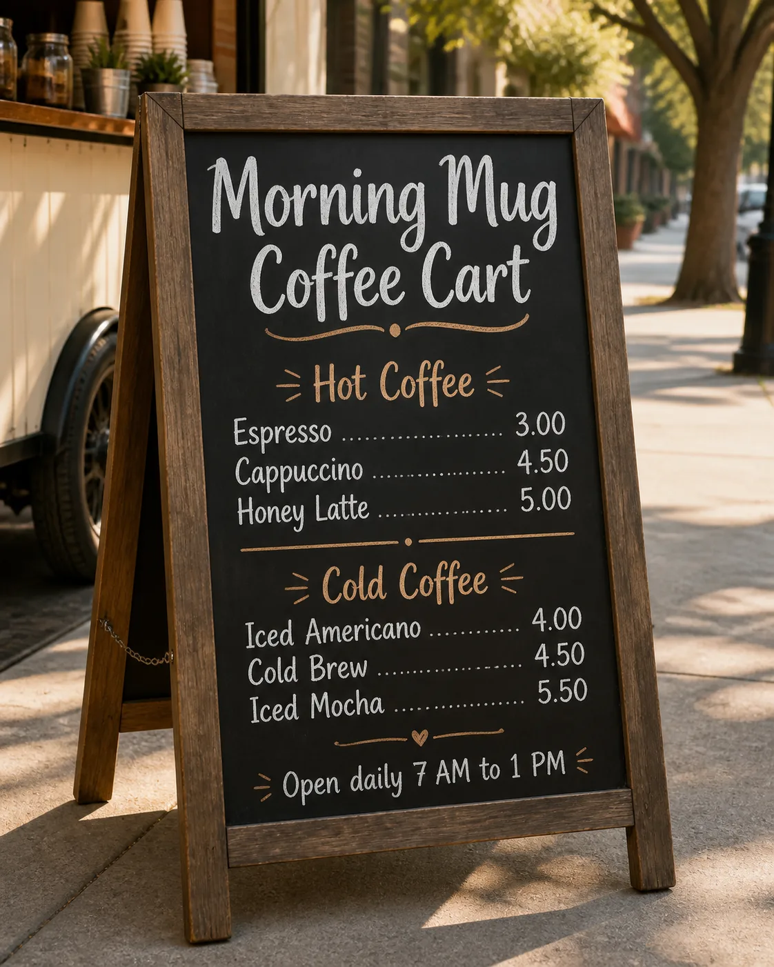
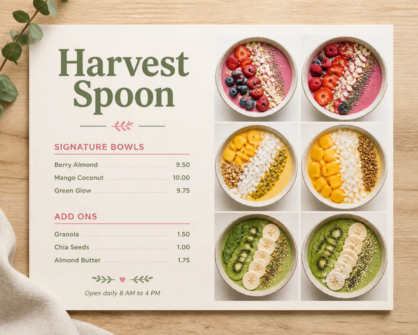
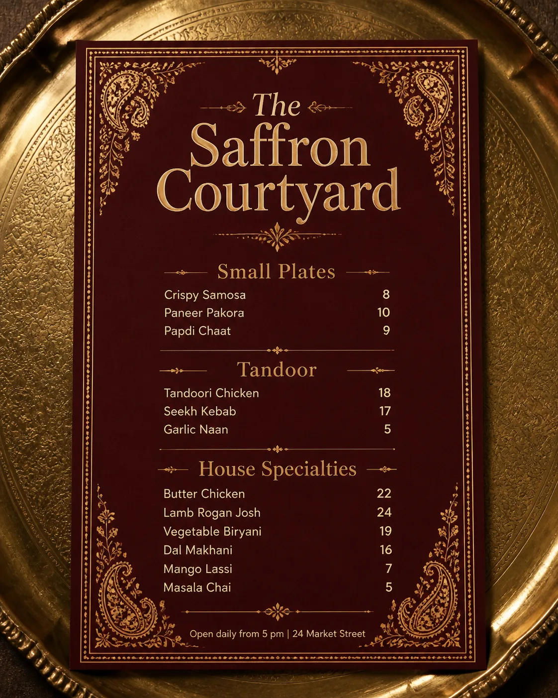
Lay out a refined Italian trattoria menu on the Paper Material, photographed flat from directly above beside the Wine Glass. Place the Venue Name prominently at the top as the largest text element, followed by the Section Headings in a clear hierarchy. Arrange the Item Names beneath their corresponding headings, pairing each item with its matching Price in the same order and aligning prices neatly along a consistent right-hand grid. Add the Optional Footer Line in small, restrained type at the bottom. Use the Color Palette throughout the paper, typography and accents, with the Decorative Motifs framing the menu without crowding the text. Use no more than two typefaces, with classic Italian-inspired serif lettering for the venue name and highly legible supporting type. Render every word and number correctly, with generous spacing, realistic paper texture, soft natural shadows and believable top-down lighting. Keep the wine glass as the only prop, and do not add logos, QR codes or an outer border around the image.

Use these details:
Venue Name: "Trattoria Bianca"
Section Headings: ["Antipasti", "Primi", "Secondi"]
Item Names: ["Marinated Olives", "Crispy Polenta", "Burrata with Tomatoes", "Tagliatelle al Ragù", "Mushroom Risotto", "Penne Arrabbiata", "Chicken Milanese", "Grilled Sea Bass", "Eggplant Parmigiana"]
Prices: ["7", "9", "12", "16", "15", "14", "21", "24", "18"]
Optional Footer Line: "Dinner served Tuesday to Sunday"
Color Palette: "warm cream, tomato red and muted olive green"
Paper Material: "slightly textured cream paper"
Decorative Motifs: "a thin red border and delicate illustrated olive branches"
Wine Glass: "one clear wine glass filled with ruby-red wine"
Using your own logo, product or face? Attach it in the chat and say which of the details it replaces.
Your result will come out close to the example rather than identical to it. Change the details to make it yours.